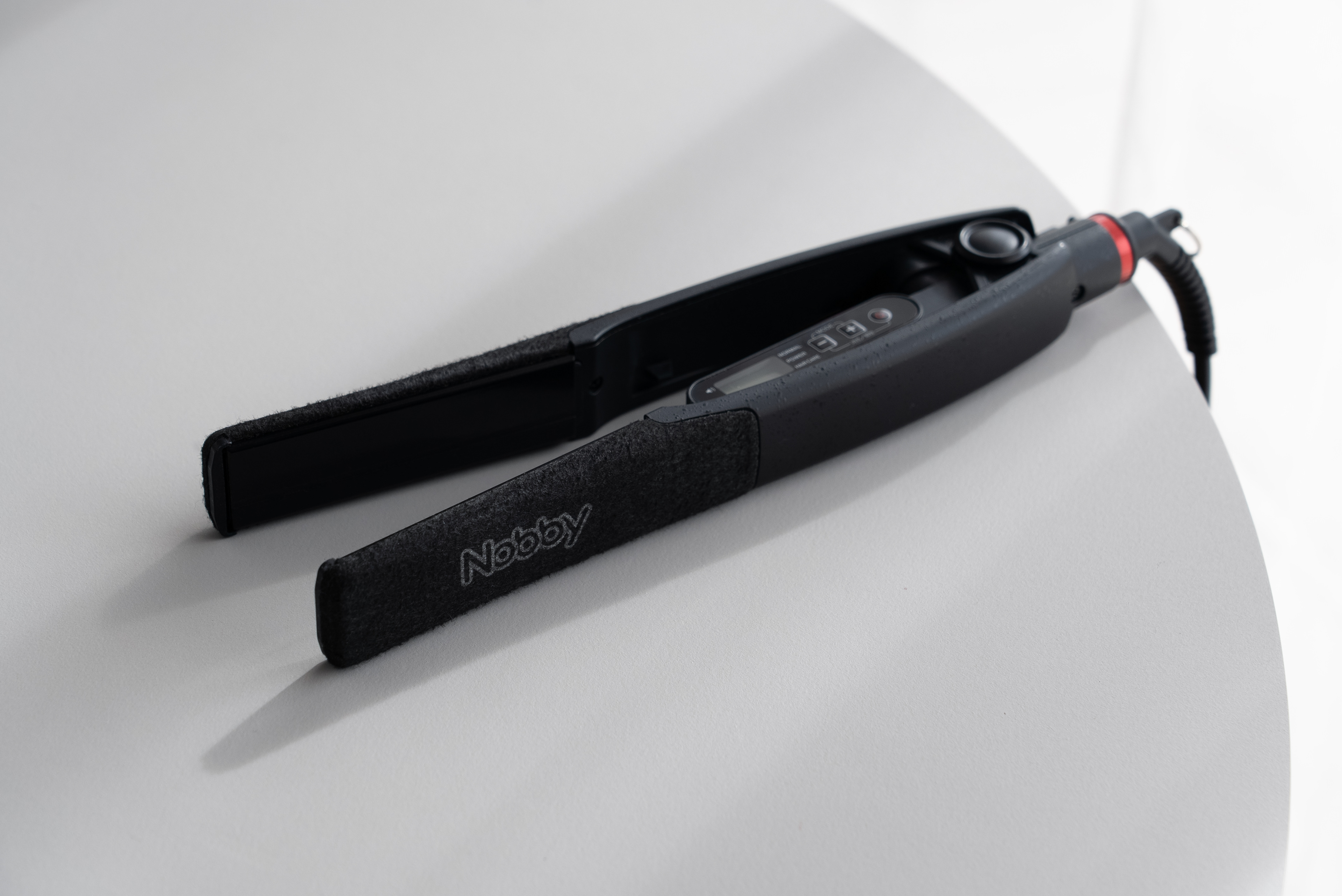
NBS1100
Hair Iron / Tescom
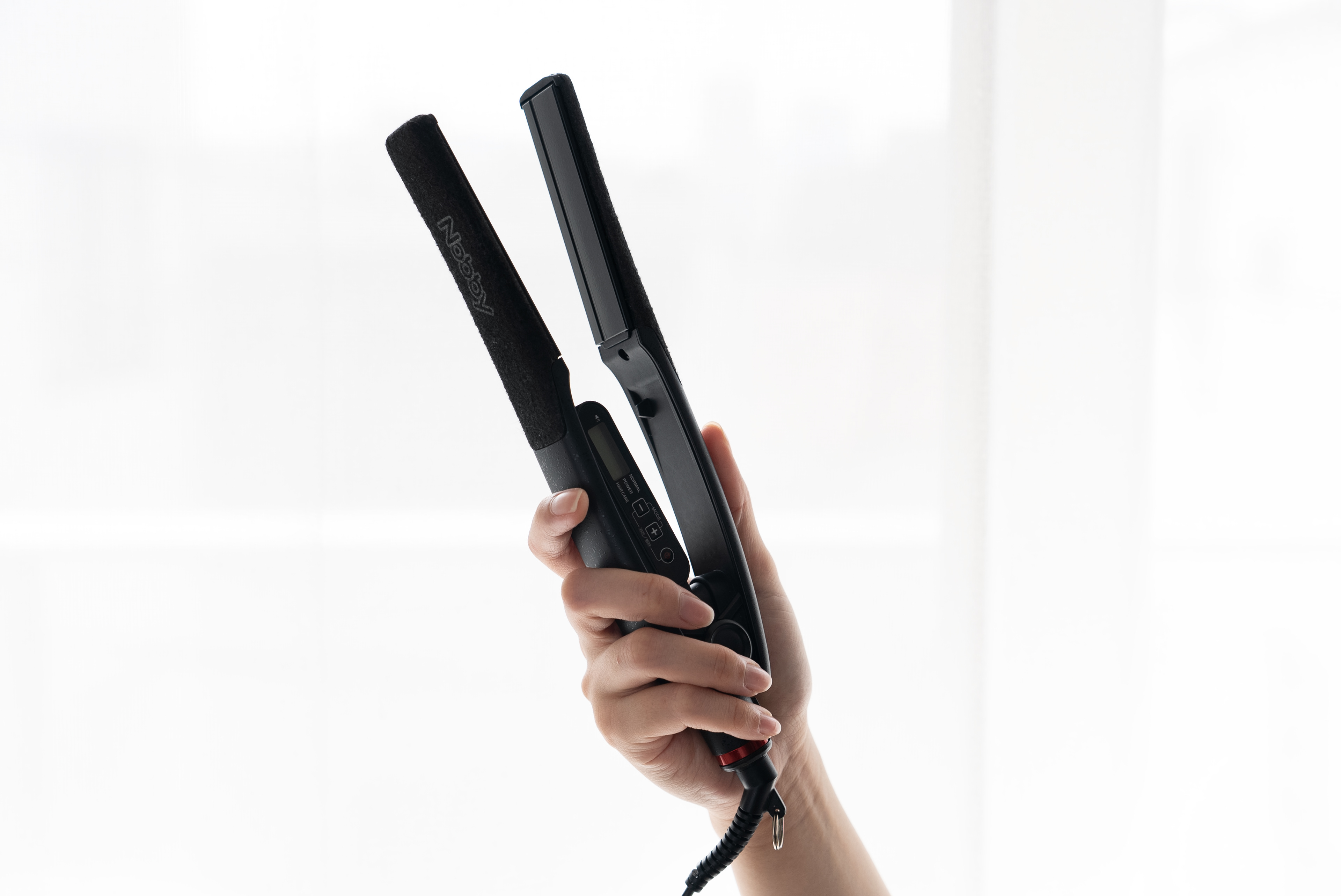
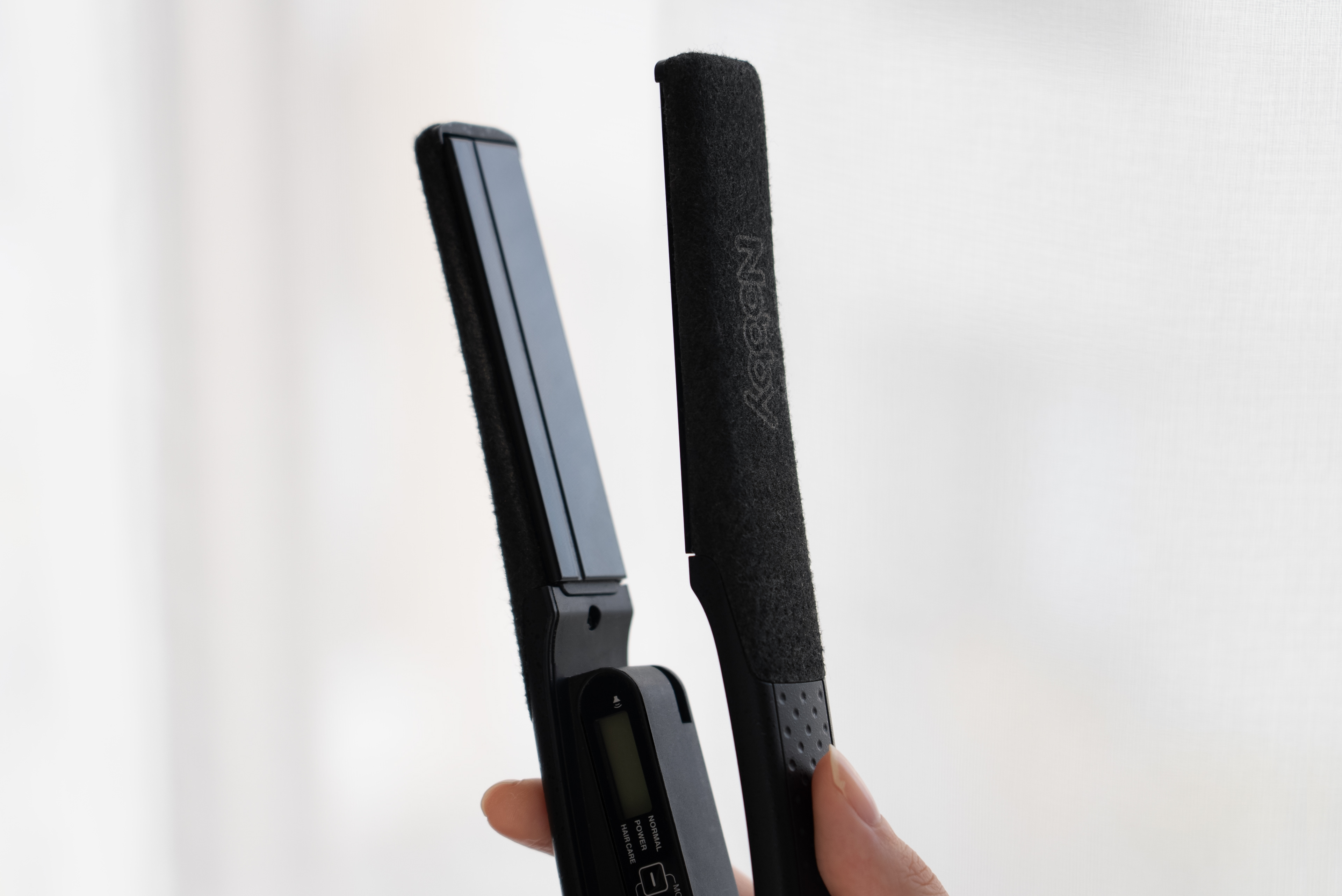
約70%のサロンで使用されている Nobbyブランドのリブランディング開発を担当しました。
Hair Iron / Tescom
約70%のサロンで使用されている Nobbyブランドのリブランディング開発を担当しました。
プロフェッショナルが日常的に使うツールとしての信頼性と存在感を重視し、ブラックを基調とした配色をベースに、重厚感と道具としての安心感を備えた佇まいを設計。
そこに Nobbyのブランドカラーである「赤」のエンドリングを象徴的に配置しました。
そこに Nobbyのブランドカラーである「赤」のエンドリングを象徴的に配置しました。
過度な主張を避けながらも視認性の高いアクセントとすることで、一目でNOBBYと認識できるブランド性と、揺るぎない機能性の両立を目指しました。
I led the rebranding development of Nobby, a professional hair tool brand used in approximately 70% of salons.
Focusing on reliability and presence as a tool used daily by professionals, the design adopts a black-based color scheme to create a solid, trustworthy appearance befitting a professional instrument.
The brand’s signature red is applied as a symbolic accent on the end ring.
By keeping the expression restrained while ensuring high visibility, the design balances strong brand recognition—instantly identifiable as Nobby—with uncompromising functionality.